McLaren unveils its fresh new logo design.
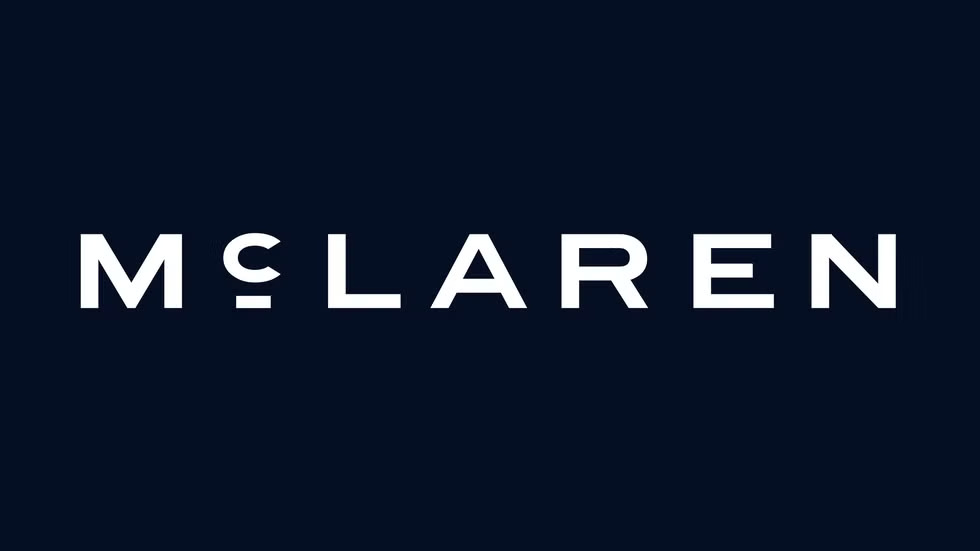
McLaren has updated its logo for its next-generation cars, as it is inspired by the late founder Bruce McLaren’s parents' service station situated in Auckland, New Zealand. The logo also represents a new bespoke typeface called McLaren Sans.
This new logo will be used in cars, merchandise, branding and digital channels, as it will be implemented by McLaren Racing and McLaren Automotive. The first vehicle to come with the new branding will be the 2026 McL 6GT concept, which was introduced recently at Monterey Car Week organised in California.
New McLaren Logo Details
McLaren's new Logo has been introduced just a week after the company announced its plans to expand its UK operations by opening a second manufacturing facility. The new logo uses a wide, all-capital sans-serif typeface, instead of a lowercase ‘C’, which is presented on a small horizontal line to match the height of the other letters.
.jpg)
However, the ‘Speedmark’ motif from the current logo will remain “as a little identifier”. The Chief creative officer, David Woodhouse, expressed his views and termed Bruce McLaren’s legacy as one of the major reasons behind the rebranding. However, the new identity also reflects the company’s future rather than a retro remembrance.
According to the company, Bruce engineered “the racing car that would take him to the first victory”. The manufacturer is also changing its corporate colour scheme, and is implementing darker colours as it defines a more midnight-themed look.
However, the McLaren’s signature Papaya Orange colour will be utilised to its racing teams, although it will be also used across automotive businesses.
Also check: Honda Refreshes Iconic H Logo | Next-Gen Electric Vehicles

.webp)